Name in 3D: A Practical Guide to Creating 3D Text
You've got a name in mind, maybe for a profile graphic, a game sign, or a plaque, and the first result looks great on screen. Then you try to use it. The letters blur at thumbnail size, the mesh won't open cleanly in your game, or a printer fills in the counters. The problem usually isn't the idea. It's that the design was made without deciding where it needed to work.
A name in 3D isn't one task. It's a chain of choices about readability, geometry, materials, and delivery. Choose the destination first, and the tools and settings become easier to judge.
Table of Contents
- What It Really Means to Make a Name in 3D
- Writing Prompts That Give AI Text-to-3D a Fighting Chance
- Extruding a Name the Manual Way in 3D Apps
- Comparing AI Output and Manual Meshes for Your Destination
- Texturing, Remeshing, and Retopology for a Production-Ready Name
- Exporting and Rendering for Print, Real-Time, and Presentation
- Putting It All Together and Avoiding the Usual Pitfalls
What It Really Means to Make a Name in 3D
A “name in 3D” can mean a polished wordmark for a website, a sculpted hero object for a portfolio, a sign inside a game, or lettering that needs to survive physical printing. Those outcomes may share the same word, but they don't share the same production requirements.
Start with the place the name will live. A web graphic can use dramatic reflections and a shallow extrusion because the final deliverable is an image. A game asset needs manageable geometry and a file format the engine can use. A printed plaque needs solid, repairable geometry and strokes that remain visible after fabrication. A client presentation may prioritize camera angles, surface finish, and a clean handoff over editable mesh topology.
Decide the destination before the tool
Ask four questions before opening a generator or 3D app:
- Where will it appear? On a screen, in a real-time scene, in a client deck, or on a printed object?
- Who needs to read it? A viewer glancing at a small icon has different needs from someone looking at a large sign.
- At what scale will it be viewed? Perspective, depth, and bevels can swallow letter shapes when the name is reduced.
- What happens to the file next? It may need to be edited, textured, animated, sliced, or rendered.
That last question separates an attractive image from a usable asset. A render can hide messy geometry, closed letter counters, and missing surfaces. The same issues become obvious once you rotate the mesh, bring it into a game engine, or prepare it for a slicer.
There's a useful visual distinction between 3D lettering and raised embroidery. If you're comparing how dimensional text behaves across materials, this guide to avoiding foam exposure in embroidery fonts offers relevant context for a different production process.
Practical rule: Choose the destination first. The font, depth, bevel, topology, and export choices should follow it.
Writing Prompts That Give AI Text-to-3D a Fighting Chance
AI can give you a fast starting point, but a prompt that only says “make my name 3D” leaves too much open. The system has to guess the letter style, material, lighting, and composition. It may return an impressive object that gets the spelling or structure wrong.
Build the prompt from four cues: typeface, material, lighting, and background. State the name clearly, specify whether it's uppercase or lowercase, and describe what the letters should look like rather than asking for “cool” or “professional.”
For example, a vague prompt might be: “Create a 3D name logo for Maya.” A more useful version is: “Create the exact uppercase word ‘MAYA' in bold geometric sans-serif lettering, shallow beveled extrusion, brushed silver material, soft studio key light, plain dark background, front-facing camera, clean separated letters.” The second prompt gives the generator a clearer target and avoids adding scene details that compete with the word.
For prompt structure and iteration, use this practical guide to text-to-3D prompt engineering.
Fix the letters before polishing the surface
When the result is close but not usable, diagnose the failure rather than changing every part of the prompt at once.
- Distorted letterforms: Put the exact name in quotation marks, specify case, and describe a familiar type category such as bold sans-serif. If a glyph is still wrong, try another generation instead of treating the damaged mesh as finished typography.
- Fused counters: Counters are the enclosed spaces in letters such as A, B, and R. Request clearly open interiors and inspect the front view; dramatic angle and heavy depth can make a partly blocked counter look intentional until the mesh is rotated.
- Missing strokes or inconsistent depth: Ask for uniform extrusion and a straightforward camera angle. A plain background makes gaps and uneven surfaces easier to spot.
- Unwanted decoration: Remove style words that invite extra shapes, ornaments, or a complex scene. Ask for isolated lettering before adding props or a backdrop.
The visual style of the engine matters too. One model may create crisp, beveled forms, while another leans toward soft or sculptural results. Choose based on the destination: a clean wordmark needs controlled edges; an organic sculpted treatment may suit a presentation render, but it can be harder to read or edit.
Give a promising result a second pass if the silhouette is nearly right and the flaw is localized. Switch to manual modeling when the spelling, spacing, or basic letter construction is wrong. Re-rolling a broken silhouette rarely fixes the underlying problem.
Extruding a Name the Manual Way in 3D Apps
Manual extrusion is the reliable route when you need predictable spelling and spacing. In Blender, for example, start with a medium-to-bold sans-serif text object, adjust its tracking, then convert the text to a curve or mesh when you're ready to inspect the outlines. Similar workflows exist in other 3D applications, though menu names differ.
Before adding depth, inspect every glyph contour. Letter outlines need to be closed so the extrusion forms a solid surface. Look closely at thin strokes and counters, especially in letters such as A, B, and R. A viewport can make a flawed contour look fine from one angle, so rotate the text and check for gaps or unwanted filled areas.
Set spacing, depth, and bevel with the use case in mind
Increase tracking slightly before extrusion. Perspective and the added sidewalls make letters appear tighter, so spacing that looks comfortable in flat text can feel crowded in a 3D view.
Extrude only as far as the design needs. Shallow depth often reads better for a logo or screen graphic; greater depth may suit a physical object or a sign meant to be seen from an angle. A bevel catches highlights and softens the front edge, but an oversized bevel can consume the face of a narrow letter. Set a restrained bevel first, then check the name at the camera angle and size where it will be used.
A good test is to compare the flat silhouette with the finished angled view. If the name becomes harder to read after depth and bevel are added, reduce the styling before increasing the render quality.
The common manual failures are straightforward to prevent: thin strokes can collapse during mesh conversion, counters can close if the bevel is too aggressive, and excessive depth can turn a word into a block. Check the outline before conversion, inspect the front face after beveling, and return to the intended view before calling the mesh done.
The same base lettering can serve a keychain or a storefront sign, but don't assume one set of dimensions works for both. Scale the geometry, bevel, and material treatment for the intended object, then check readability at the actual viewing distance. Rebuilding from scratch is often unnecessary; ignoring the changed scale is what causes trouble.
Comparing AI Output and Manual Meshes for Your Destination
AI and manual modeling solve different problems. AI can explore surface styles quickly, while manual extrusion gives you control over the letterforms. Neither result is production-ready just because it renders well.
Judge each candidate against its destination. For a printed object, inspect whether the mesh is closed and solid. For a game asset, check whether its polygons and UVs support the intended materials and engine workflow. For a presentation render, surface appearance and camera flexibility may matter more than perfectly organized edge loops, though broken geometry can still cause shading artifacts.
Use a fast readability and editability check
First, reduce the name to thumbnail size. A small preview exposes weak silhouettes, cramped spacing, and bevels that overwhelm the letter faces. You can also squint at the model or view it from a distance. If the name stops reading, extra texture detail won't rescue it.
Then rotate the mesh and inspect the parts a single render can conceal:
- Legibility: Are the letters recognizable from the views the audience will see?
- Topology: Does the surface hold its shape, or do visible artifacts appear as you rotate it?
- Texture readiness: Can you assign or bake materials without obvious stretching or awkward seams?
- Editability: Can you alter the shape, spacing, or material without fighting tangled geometry?
AI output may need substantial cleanup if it has irregular surfaces, distorted lettering, or no useful UV layout. A clean manual mesh may be easier to edit, but it can take longer to make visually distinctive. Decide by comparing the work still required, not by judging which first result looks more impressive.
If the first mesh fails on a basic requirement, generate another pass or rebuild the letters. Don't spend time texturing a name that can't be read or a mesh you can't export reliably. That early decision saves more time than polishing a flawed result.
Texturing, Remeshing, and Retopology for a Production-Ready Name
Once the letterforms work, make the surface support the intended use. In a PBR workflow, adjust the material's base color, roughness, and metallic response to create believable finishes. Glossy metal can help a hero render catch sharp highlights, while matte plastic often reads more clearly in a game scene. Emissive material can make a sign feel lit, but it may flatten the letter shape if the glow dominates the edges.
Use a simple material pass first. A neutral material makes geometry problems easier to see; elaborate surface effects can disguise uneven bevels or distracting seams. Add detail only after the name holds up in the camera view.
Clean the geometry to fit the destination
Remeshing redistributes polygons to make a surface more even. Retopology rebuilds the mesh with a cleaner structure, using quads or triangles suited to the asset's next job. For a static render, you may not need to rebuild every edge. For a real-time asset or a name that deforms, organized topology gives you more control over shading and performance. This overview of 3D mesh topology provides further guidance on how mesh structure affects production use.
| Destination | Texture approach | Remesh density | Retopo style |
|---|---|---|---|
| Presentation render | Metallic, matte, or layered PBR material | Keep enough detail to preserve the bevel | Clean surfaces with readable edge transitions |
| Real-time scene | PBR textures suited to the engine | Use only the density needed to hold the silhouette | Optimized triangles or clean quads for the asset's role |
| 3D print | Usually rely on the object's surface rather than UV detail | Preserve the letter edges and solid form | Watertight, closed geometry suitable for slicing |
Avoid cleanup that removes the design
Retopology can make a mesh easier to use, but careless rebuilding can flatten bevels into hard edges, skip the inside walls of counters, or add needless polygons to a flat letter face. Check the result against the original silhouette and rotate it under neutral lighting. For longer horizontal strokes, inspect the UV layout for stretching; a material that looks fine on the front may smear along the sides if the islands are poorly arranged.
The right cleanup is the least work that meets the handoff requirement. A static logo render doesn't need the same mesh treatment as a game asset, and a printable solid doesn't need a detailed texture workflow. Keep the destination in view so you don't overbuild.
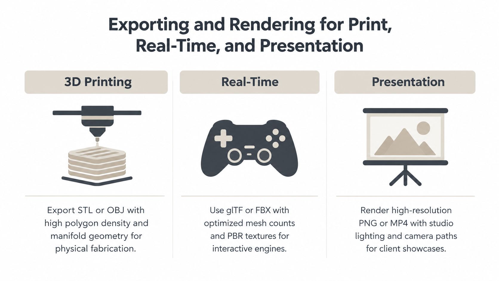
Exporting and Rendering for Print, Real-Time, and Presentation
Export isn't a final button press. It's the handoff that determines whether the name arrives intact in a slicer, engine, or client review.
| Destination | Useful formats | What to verify |
|---|---|---|
| 3D printing | STL or 3MF | Closed geometry, scale, orientation, slicer preview |
| Real-time engine | GLB or FBX | Mesh structure, materials, texture paths, import result |
| Presentation | PNG or MP4 render | Camera, lighting, resolution, background, playback |
Match the export to the handoff
For 3D printing, export a solid mesh and open it in the slicer before sending it to the printer. Check scale, orientation, and whether the slicer identifies holes or unsupported details. Place the name so support contact doesn't scar the visible letter faces where possible. STL is a common mesh handoff; 3MF can carry more production information, depending on the workflow. A format guide comparing STL and OBJ exports can help when choosing a file for the next application.
For real-time work in Unity or Unreal, GLB and FBX are common options. Confirm that materials and textures come through as expected, and check the imported asset in the target engine rather than trusting the modeling viewport. If the name uses repeated letter parts or several materials, inspect how the export affects draw calls and material assignments. An atlas can simplify a set of related surfaces, while one material per letter can create avoidable complexity.
For presentation, export a high-resolution still or turntable only after checking the camera and reflections. A 4K render is useful when the client needs detailed review, but it won't fix poor lighting or a distracting set. Keep the background and scene simple enough that the lettering stays dominant.
Sculpty provides a browser-based workflow for text-to-3D generation, PBR texturing, mesh cleanup, rendering, and exports including GLB, STL, OBJ, FBX, and 3MF. Its 360-degree turntable export can also help present a name from multiple angles. Whatever tools you use, reopen the exported file in its destination app and verify the result there.
A short visual walkthrough can help illustrate how a finished name moves through creation and presentation:
Putting It All Together and Avoiding the Usual Pitfalls
Keep the workflow simple and repeatable:
- Choose the destination. Know whether the name is for a screen, game, print, or presentation.
- Pick the route. Use AI to explore looks, or manual extrusion when letter accuracy and spacing need direct control.
- Generate the base. State the exact name and intended style, or build clean outlines.
- Check the silhouette. Test readability at thumbnail size and inspect the counters.
- Clean the asset. Texture, remesh, or retopologize only as the destination requires.
- Export and verify. Open the file in the target app or slicer before handing it off.
Watch for the problems that render previews often hide. Thin strokes may disappear in a print, so check the actual fabrication requirements and test a sample. AI output can block counters, so inspect every letter from the front and side. A name that looks dramatic at full size may become unreadable as a small icon, so test it at its final display size.
Font licensing needs attention before client delivery or commercial use. Broken exports need a practical check: reopen the file in the intended application, inspect materials and scale, and confirm the mesh behaves as expected. Don't rely on a render as proof that the asset is sound.
Accessibility and cultural adaptability matter too. Check contrast and silhouette recognition, provide an appropriate text alternative when the name appears in an interface, and confirm that the selected font supports the writing system you need. Latin-letter presets don't automatically work for scripts that require different glyph construction or shaping.
With the destination decided and the checks built into the process, creating a usable name in 3D becomes far more predictable. Start with a word you need, make a first version, and test it where it will be used.
Sculpty brings text-to-3D generation, PBR texturing, mesh cleanup, rendering, and common asset exports into a browser-based studio. Try it for your next name in 3D project, then visit Sculpty to explore the workflow.